BETA
The Visual Form builder provides a flexible visual solution as an alternative to JSON schema for building Custom Forms.
The Visual Form Builder is accessible from the Custom Forms page when creating a new form. From the top-right of the page, a 'Go To Visual Form Builder' button will appear, allowing users to switch between the JSON Form builder and the Visual Form builder.
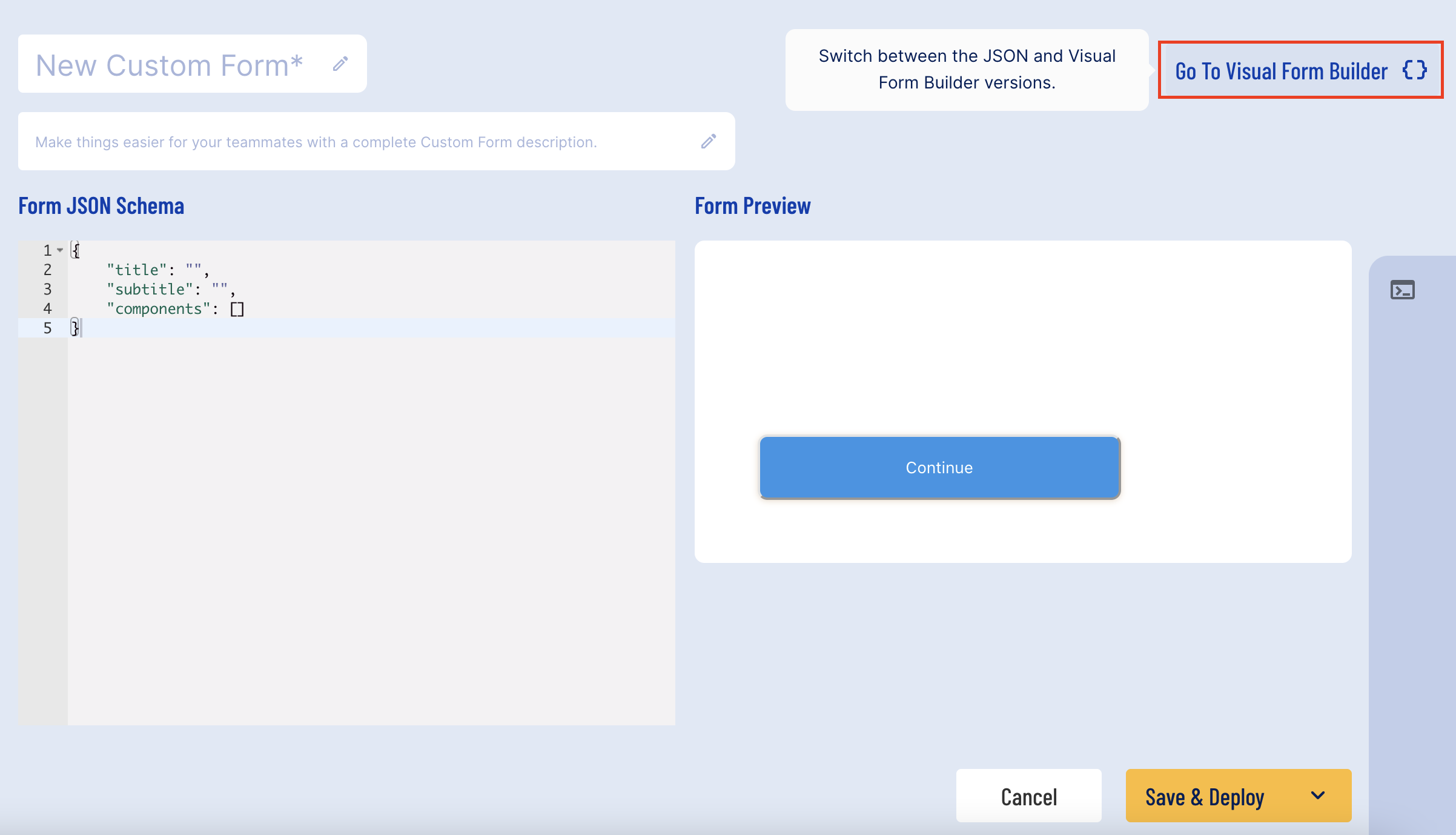
Clicking this button will open the Visual Builder. Once open, it is possible to return to the JSON Form builder by clicking the button from the top-right of the screen.
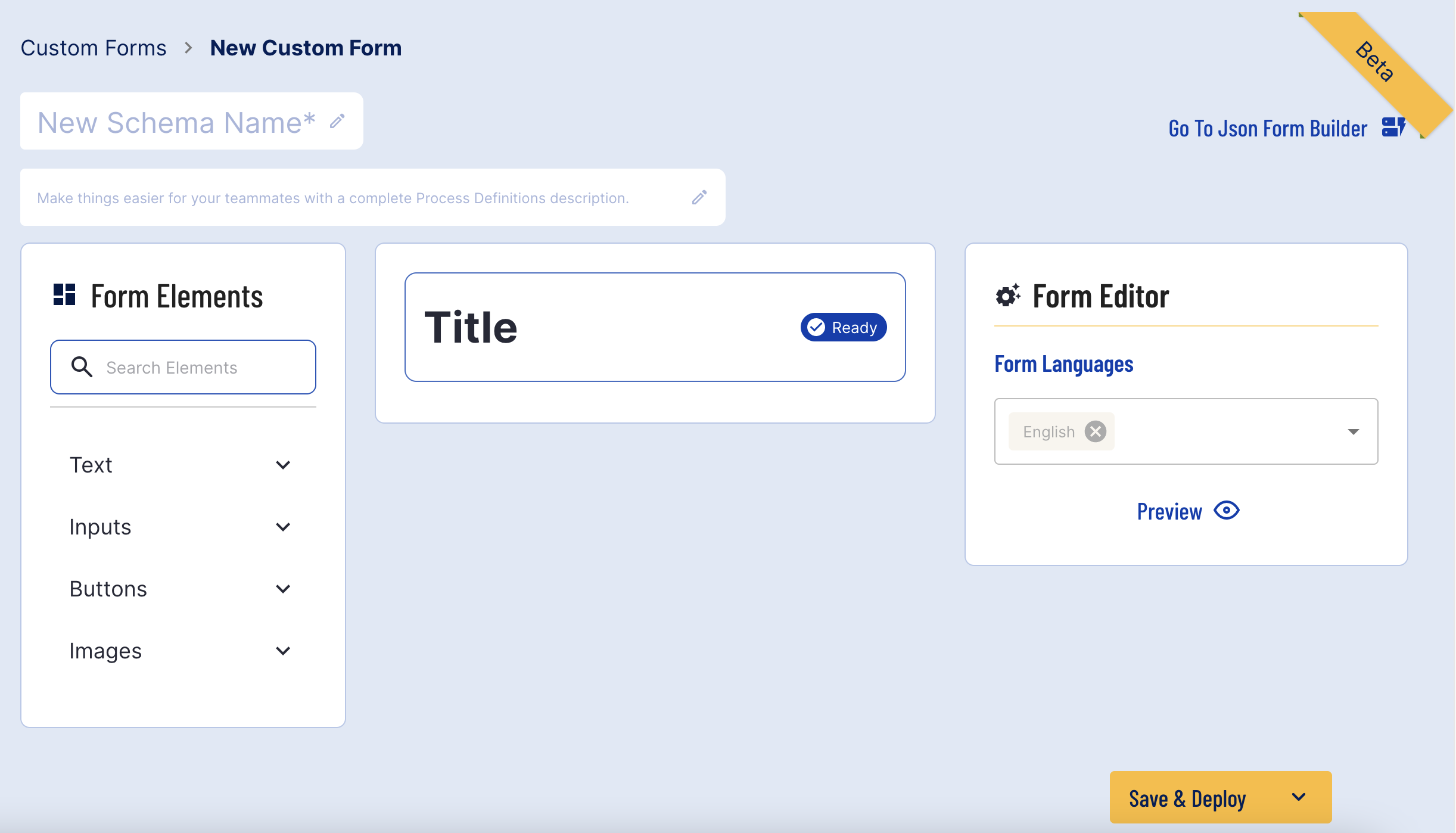
Form Builder Layout
The Form Builder is divided into three sections.
Form Elements - Lists all available form elements that can be added to the form.
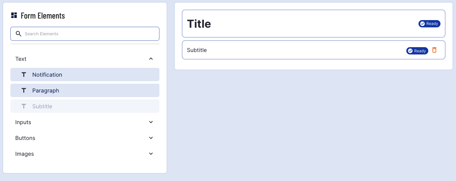
Form Builder - All elements that have been added to the form appear here. Form elements can be rearranged by clicking and dragging, and a status indicator will define whether an element has been correctly configured.
Form Editor - This is where users can configure the parameters of a selected element. This section also includes a 'Preview' button to show a preview of the form
Building a Form
Form elements allow users to add various text fields, inputs, buttons, and images to fill out the details of their form. This section will describe how to build a form using the input fields available, define properties, and edit the placement of these form elements.
Form Languages
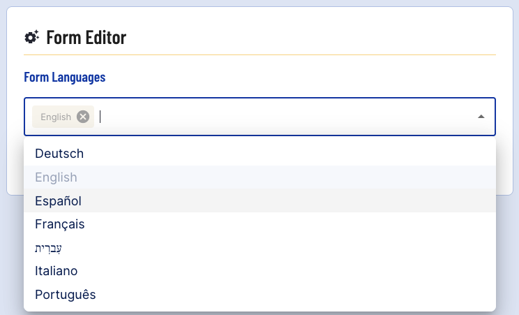
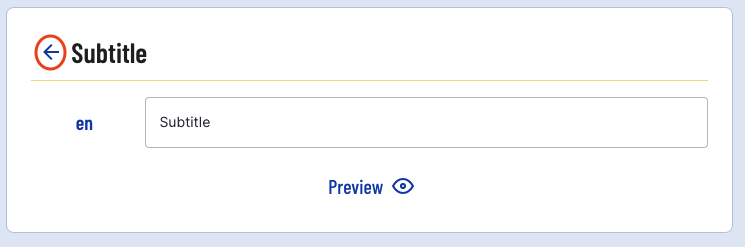
Form languages can be defined from the form editor on the right of the screen. By default, English is the only form language selected. Additional languages can be added by clicking the drop-down list and selecting an additional language.
If another element has been selected, users can return to the form language selection by clicking the back arrow next to the element name.
Adding Elements
By clicking each title, the list of options can be expanded to see all available elements.
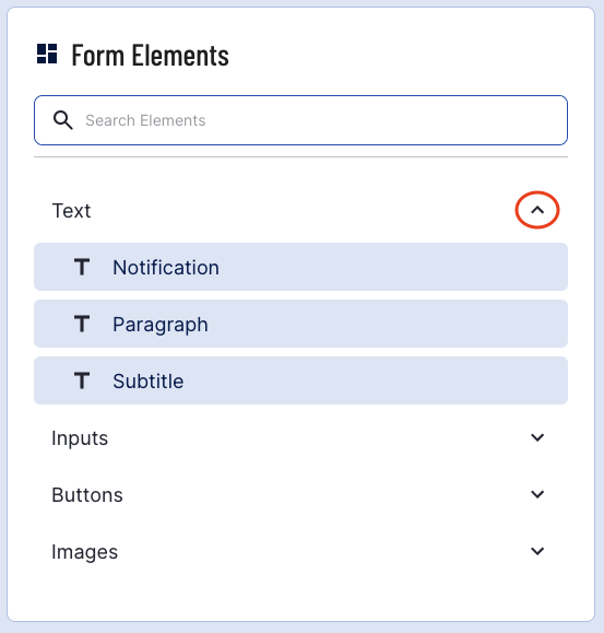
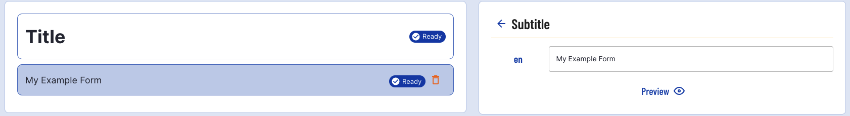
Clicking one of the buttons will add this element to the form. In this example, a Subtitle will be added which will appear under the Title.
The Subtitle element will become greyed out as only one subtitle can be added to a form.
Editing Element Parameters
To edit elements in the form editor, click the element from the form builder. Options for this element will then appear in the form editor where its properties can be defined.
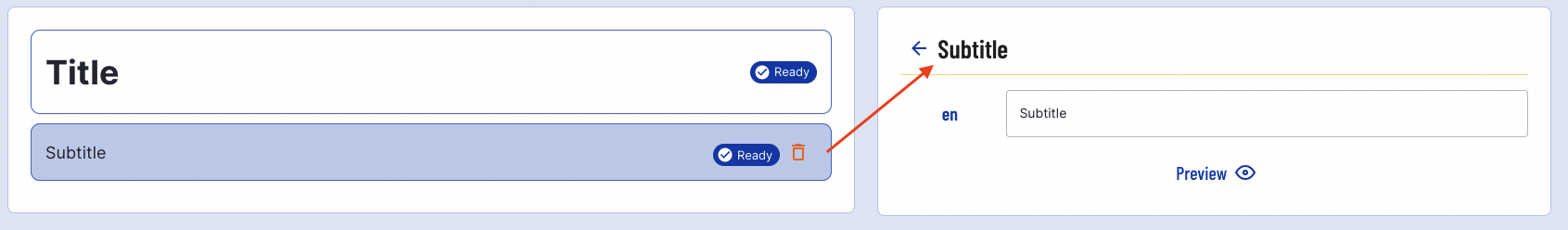
The form element will turn blue when it is selected.
The text of the subtitle can be updated by replacing the contents of the text field.
Element Statuses
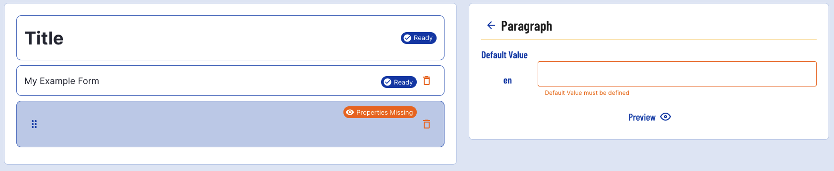
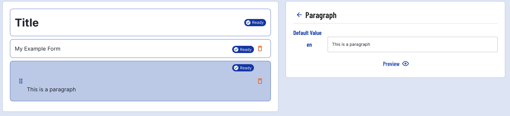
The properties of some form elements must be configured before the form can be successfully implemented. In cases such as this, the status that appears next to the form element will indicate further configuration is required.
In the example below, a paragraph element has been added to the form. The status of this form element is 'Properties Missing' when first added to the form.
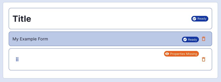
Selecting this element will open the properties configuration, which will indicate the properties that must be configured for the element to be successfully added.
Rearranging Elements
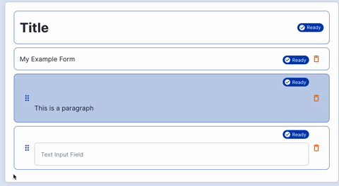
When multiple elements have been added to a form, it is possible to rearrange these elements from the form builder.
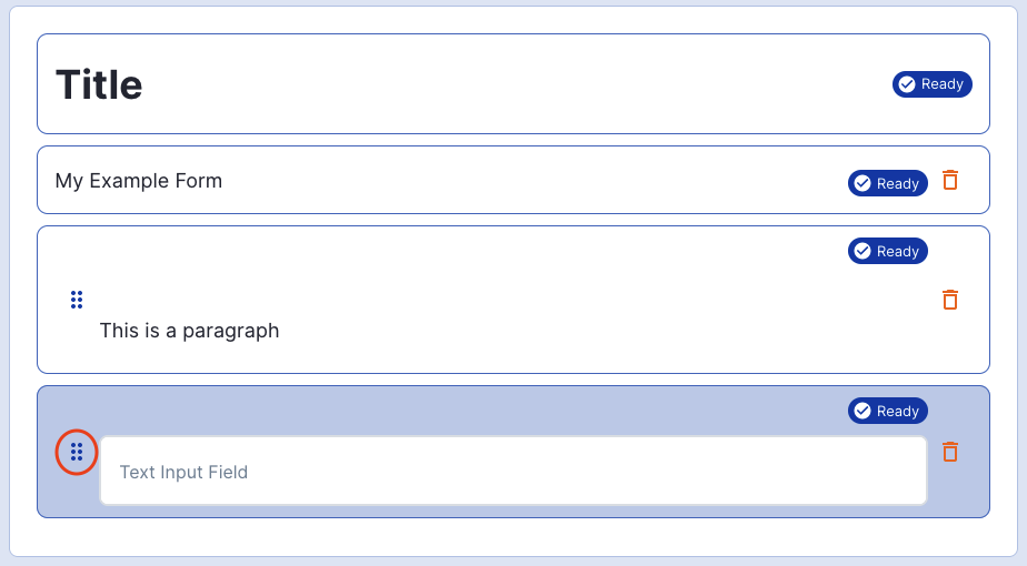
In the example below, a paragraph and text input element have been added to the form. To the left of each element, a six-dot icon indicates that these elements can be rearranged.
Some elements such as titles, subtitles, and buttons cannot be rearranged from their original position.
By clicking and dragged from the icon, the position of the element can be moved.
Deleting Elements
Elements can be deleted by clicking the orange 'Bin' icon from the right-side of the element in the form builder.
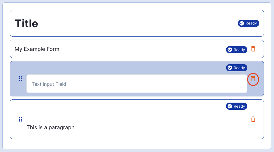
The delete action is not reversible. Once an element has been deleted, it cannot be retrieved.
Some elements such as the title cannot be deleted.
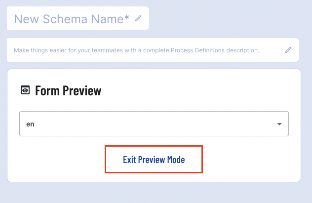
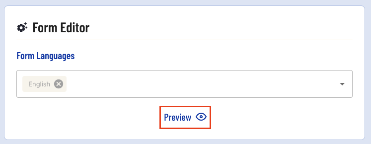
Preview a Form
A form can be previewed by clicking the 'Preview' button at the bottom of the form editor.
Clicking this button will open the preview page where a preview of the form in mobile format can be found and inputs can be tested.
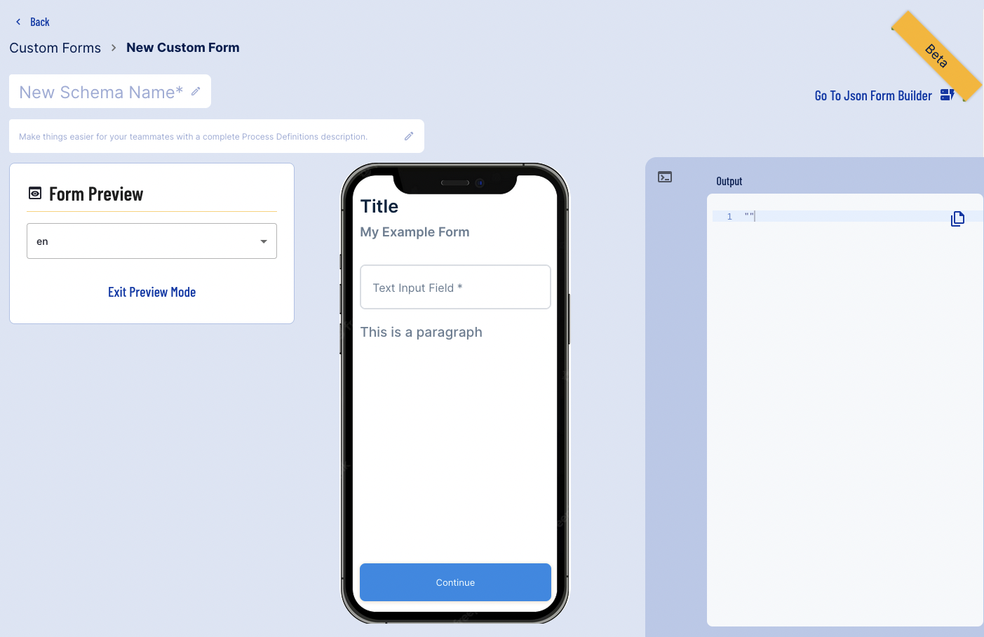
If no 'Continue' button is present in the form builder, one will be added in the preview mode.
Any input fields provided in the form can be tested by using the mobile demo provided. In this example, a response will be entered in the text field. Afterwards, the 'Continue' button is pressed where the output will be provided in the panel on the right of the screen.
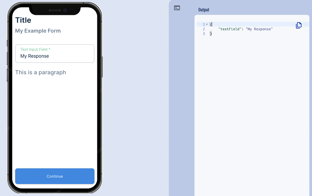
Users can exit preview mode and return to the form builder by clicking the 'Exit Preview Mode' button under the Form Preview panel.