Introduction
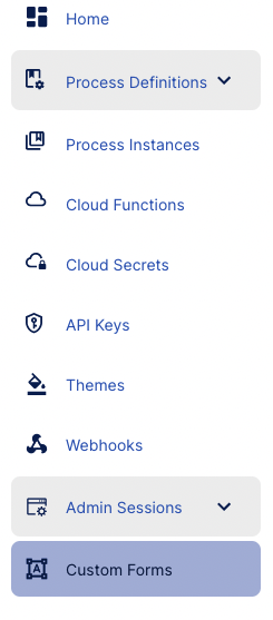
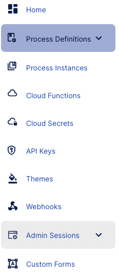
Custom Data Forms allow users to create a form with custom fields that can be introduced to the ID&V flow using the Process Designer. Custom Data Forms can be found in the Backoffice by selecting the menu option from the left-side vertical navigation bar.
Overview
The Custom Data Forms landing page is shown below. This page provides an overview of all forms created in the Backoffice and the ability to search, sort and modify specific forms as required.
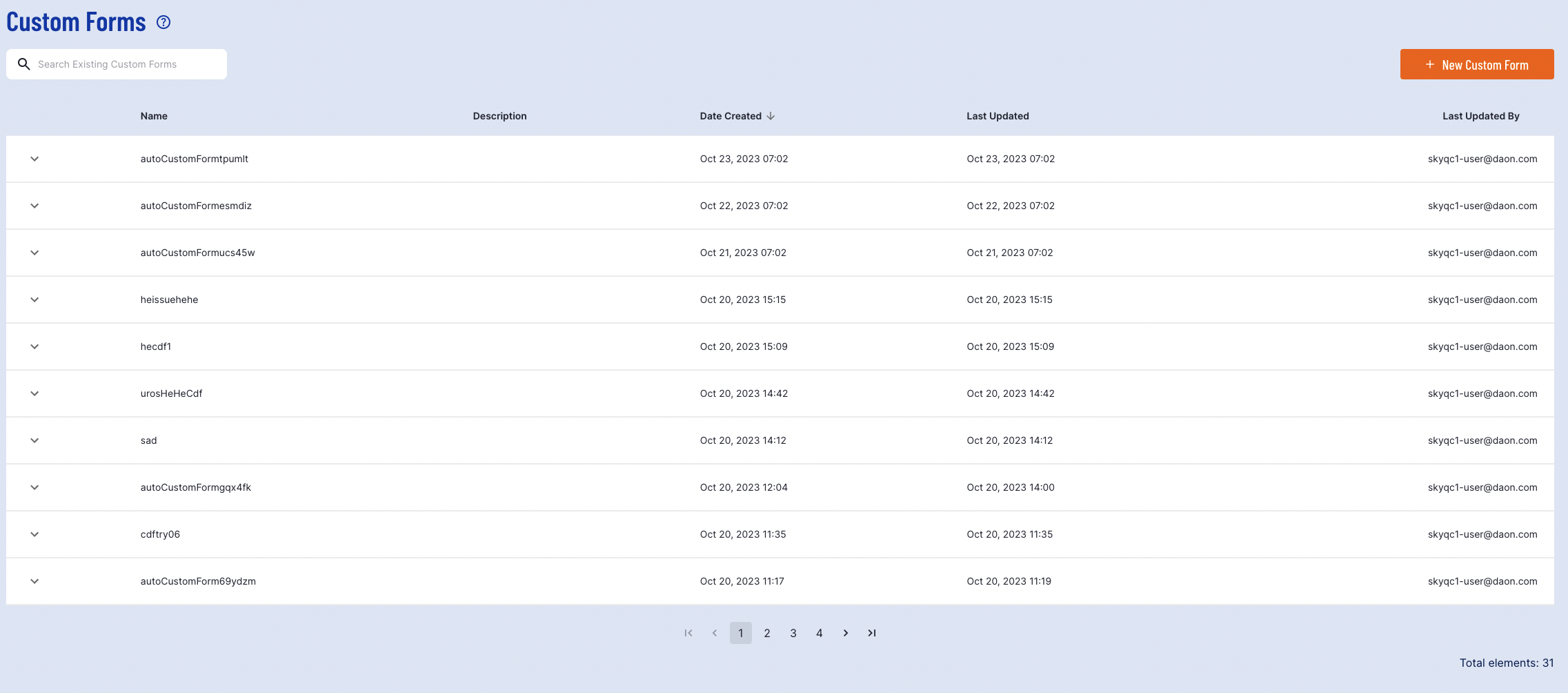
Searching for specific forms can be achieved using the search bar at the top-left of the page. This allows users to search for forms using the form Name.
Create Custom Form
To create a new form, click the 'New Custom Form' button found at the top-right of the page.

Selecting this button will open the Custom Form creation page where fields of the form can be defined using JSON schema.
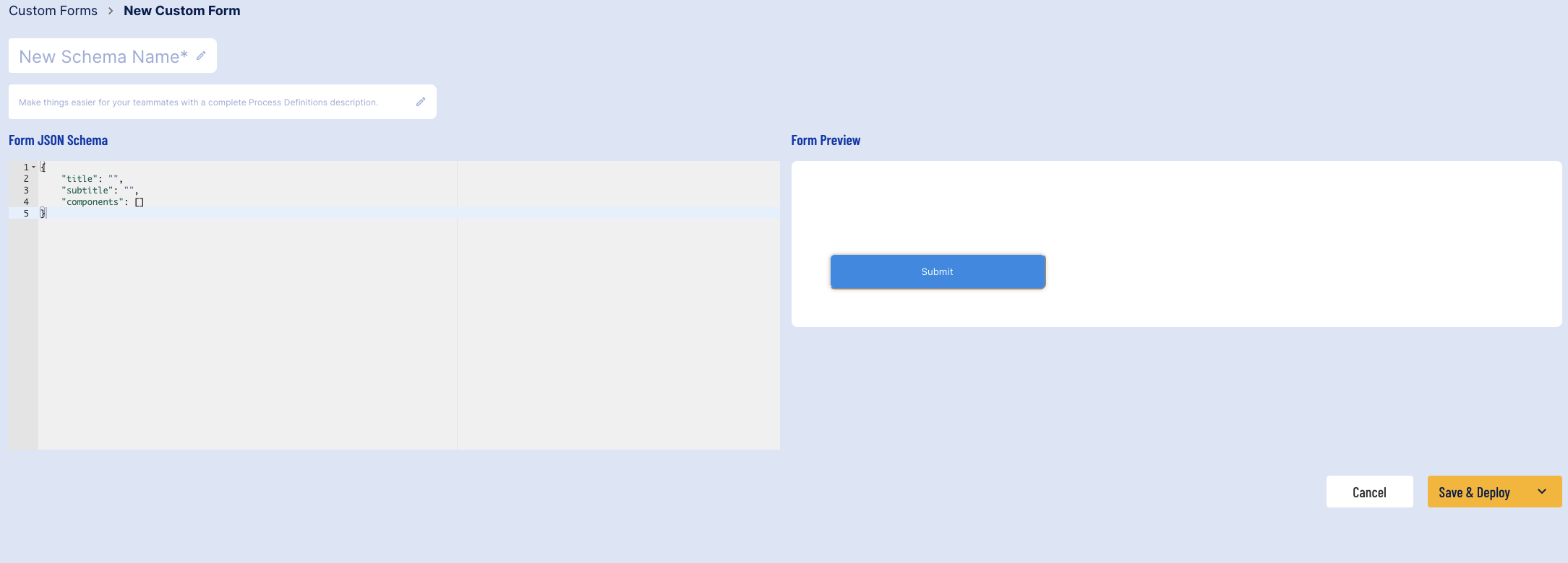
The following fields can be defined to create a new form:
Name (mandatory) - The name for the new Custom Form.
Description - A description of the new form to better define its purpose.
Form JSON Schema - Used to define the fields and items that will be displayed to the user in the ID&V flow. For more information, see the Defining the JSON Schema section.
Defining the JSON Schema
This section will describe the possible input types available when defining a JSON schema for a Custom Form.
As part of the form definition, the following component types are available:
text
paragraph
phone
email
number
date
notification
For each field, the following fields must be defined:
Field Name | Values/ Type | Description |
|---|---|---|
type | text, paragraph, phone, email, date, image, or notification | The type of field to present to the user for input. |
id | String | A unique identifier for the new field. |
label | String-value pair | Requires a string and value pair that offers a description of the field to the user. This field is required for paragraph components. For example:
Example: |
default | String | A string field that defines the default value displayed to the user. |
defaultCountry | String | For phone fields only. The default country code of the phone number to provide. Country codes must be presented as an ISO 3166 country code. For example: "ie". If left blank, this field will not show a country flag by default. |
defaultFormat | String | For date fields only. Specify the format the date will be given in. Possible values include: "YYYY.MM.DD", "MM.DD.YY", "MM/YYYY", "DD.MM.YYYY" etc. |
validate | Boolean | Allows users to define whether field validation will be performed. See the table below for validation fields. |
Below is a table of all validation values:
Field Name | Value/ Type | Description |
|---|---|---|
required | Boolean | Determines whether the field is required to successfully complete the form. |
min | Integer | The minimum accepted value to pass validation. |
max | Integer | The maximum acceptable value to pass validation. |
missingMessage | String | Displays a missing value message when the field is left blank by the user. |
invalidMessage | String | The message displayed if an invalid value is entered. |
invalidRangeMessage | String | The message displayed when a value is entered outside the min/ max. |
dateType | "futureOnly" or "pastOnly" | For date fields only. This value determines what type of date is accepted. |
allowToday | Boolean | For date fields only. A boolean value that determines whether the current date is accepted as input. |
Notification Panel Configurations
Notification panels can be used to present information to the user in color coded panels. They include the following component configurations
Field Name | Value/ Type | Description |
|---|---|---|
type | notification | The type of field to present to the user for input. |
id | String | A unique identifier for the field. |
subType | String | Possible values are "success", "error", "default", and "warning". |
closeButton | Boolean | If true, an 'X' close button will appear, allowing the end user to close the notification panel. If false, no button will appear. |
setTimer | Boolean | If true, the notification panel will appear for a time span of 5 second before disappearing. If false, the notification panel will always remain visible on the form. |
values | String-value pair | The text to be displayed. For example: `"values": { "en": "Notification" }` |
Example Notification Panel
Below is an example JSON schema that defines a form using a notification panel.
When entered into the Backoffice, the following form will be produced:
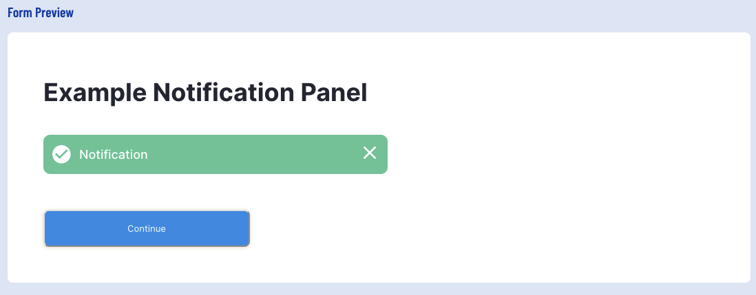
In the example above, the notification panel provides the end user with the ability to close the notification panel. This notification panel will also disappear after the allotted 5 seconds passes.
Button Configuration
Three button types are configurable for a Custom Form:
Submit - Will submit and complete the form after all required fields have been provided.
Continue - Proceeds to the next step of the ID&V process without explicitly submitting a form. This can be used for read-only and non read-only forms.
Retake - Returns the form to default value and requests the end-user to retake the form.
Each button can be configured with a text label in all languages supported by TrustX. Below is an example of each button where the English label for each is configured.
Example:
For instance, the Submit button can be used to complete the following form:
This will produce the following form in the Form Preview:
Custom Images Configuration
Images can be included in a form by adding the "image" component to the JSON schema. The following properties can configured defined. Supported image formats include: jpg, jpeg, and png.
Filed Name | Value | Description |
|---|---|---|
type | image | The type of field to present to the user for input. |
id | String | A unique identifier for the field. |
alt | String | Alternative text to display when the image cannot be found. This field is optional. |
width | String | Width value represented in percentage or pixel. For example: "100px" or "50%". This field is optional. |
height | String | Height value represented in percentage or pixel. For example: "100px" or "50%". This field is optional. |
src | String | A base 64 encoded representation of the image |
fileType | String | Represented as " |
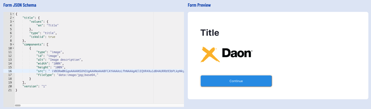
Example Custom Image
Below is an example JSON schema that defines a form using a custom image.
Transient Data
Data such as username and password may be collected using transient data. Transient data refers to data captured by a custom form that is temporary and will not be stored by the process server.
For more information on collecting transient data, see the Collecting Transient Data guide.
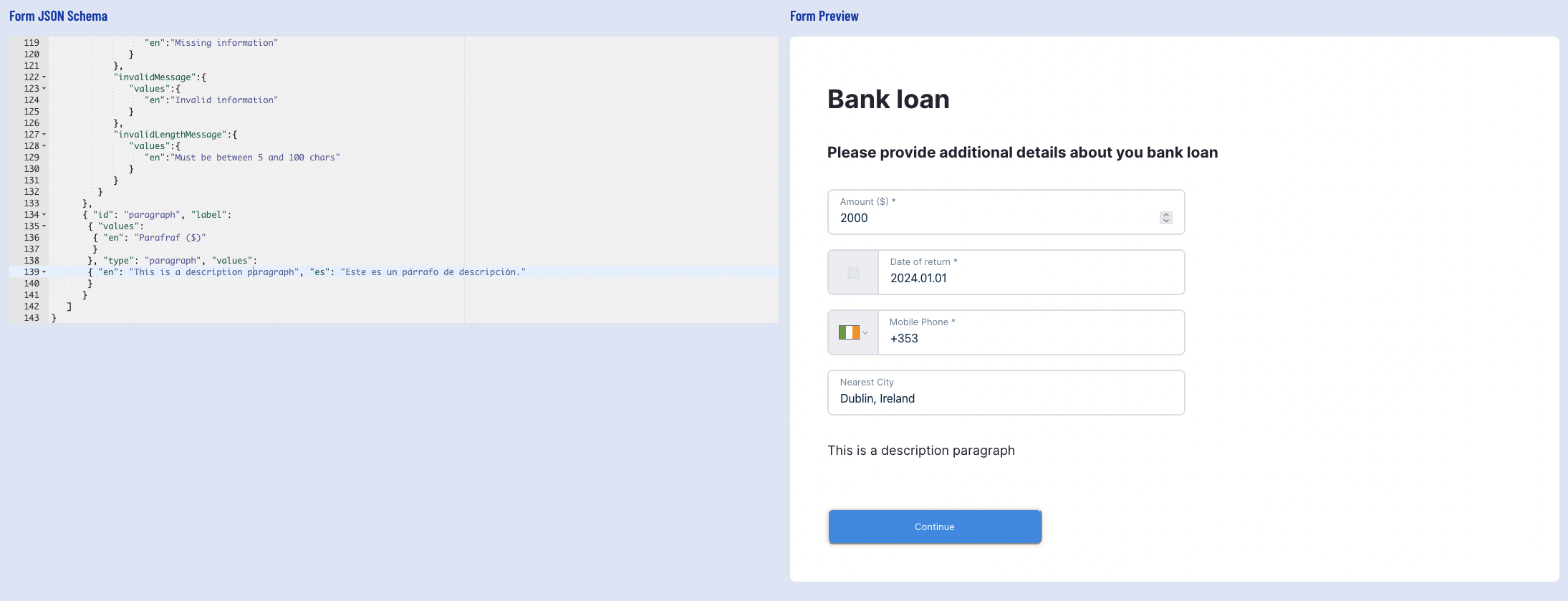
Example Custom Form JSON Schema
Below is an example JSON schema that defines a form.
The Backoffice will produce a preview of the form when entered into the JSON Schema field. The above example will produce the following:
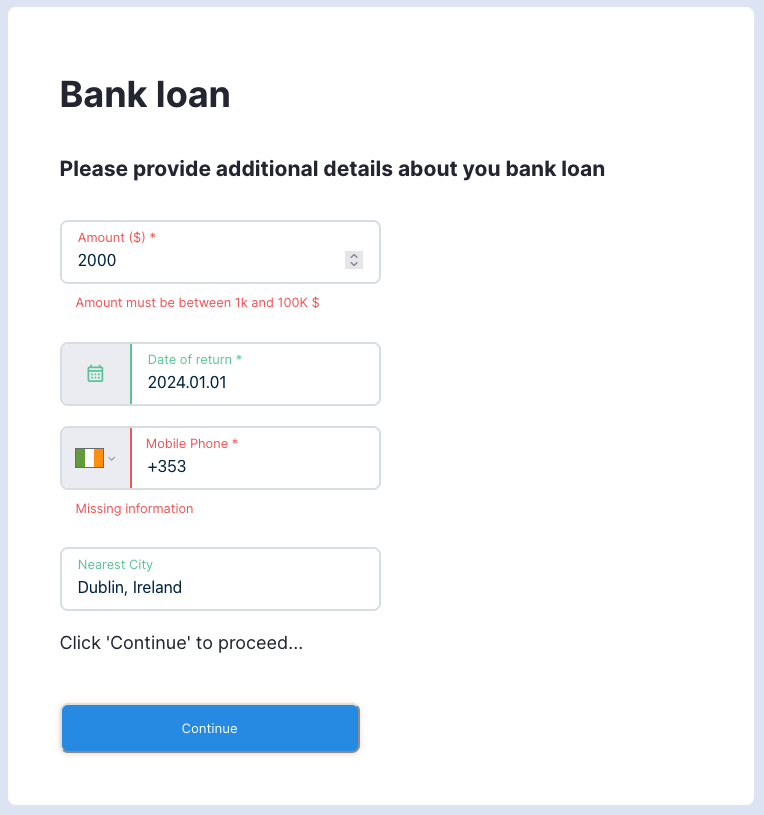
Using the Form Preview, it is possible to test the form validation and ensure all fields operate as defined in the JSON schema. After clicking the 'Submit' button in the below example, TrustX will test the form and respond with field validation defined in the schema.
It is also possible to check form output when all fields are entered successfully by using the Output menu at the right-most side of the page. Expand the menu by clicking the icon.
Once all details are entered, click the 'Save & Deploy' button to finish creating the new Custom Form.

Create a New Version
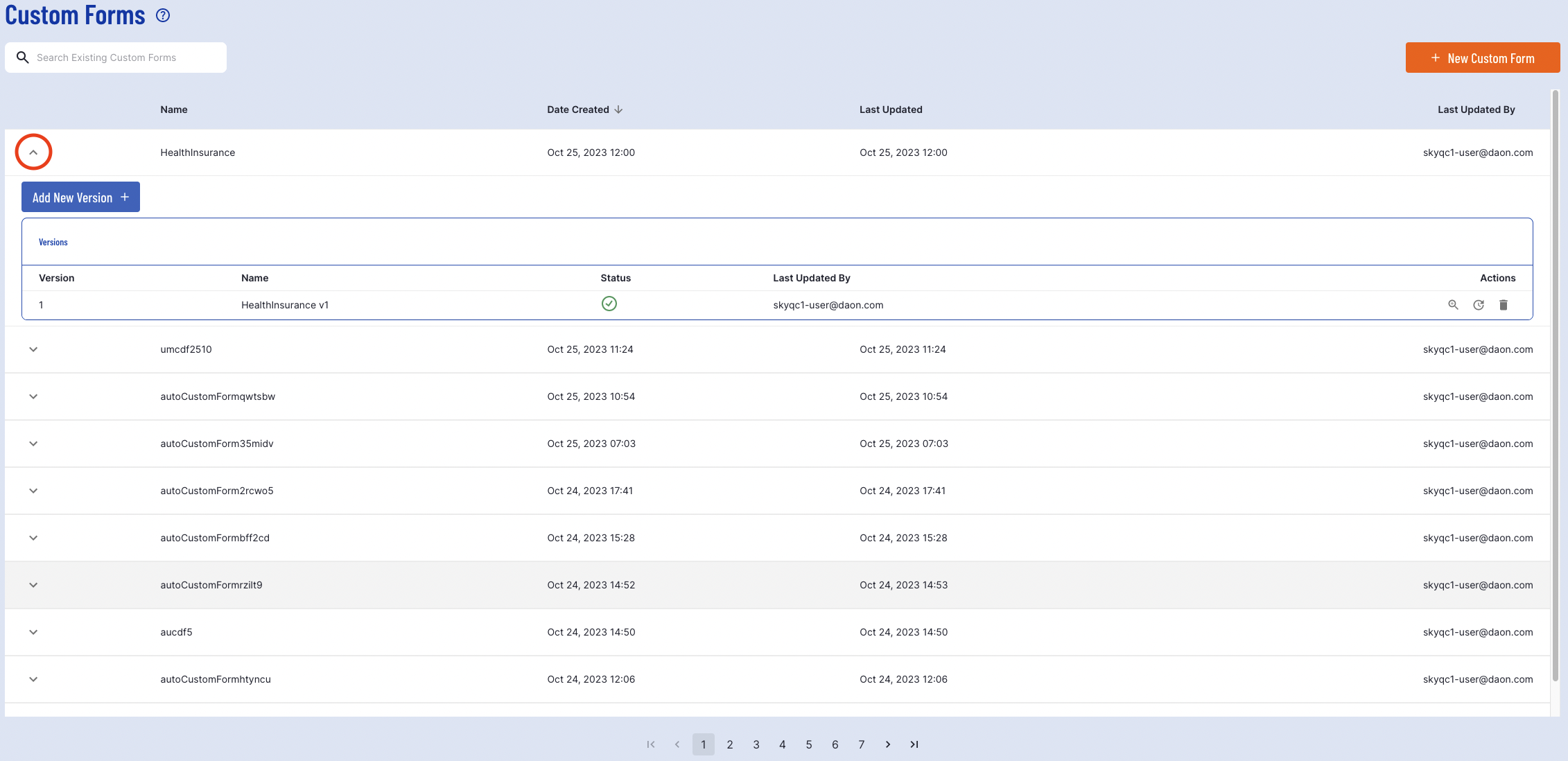
New versions of an existing Custom Form can be created from the Custom Data Forms page of the Backoffice.
To create a new version, first find the Custom Form that will be updated using the search bar or table of Custom Data Forms available. Click the arrow from the left-most column of the Custom Form table to expand the list of options under a form.
Click the blue 'Add New Version' button and a pop-up will appear enabling a new version to be created.
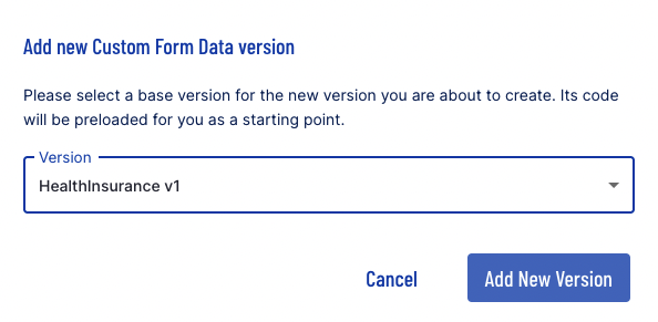
Finalize the action by clicking the 'Add New Version' button.
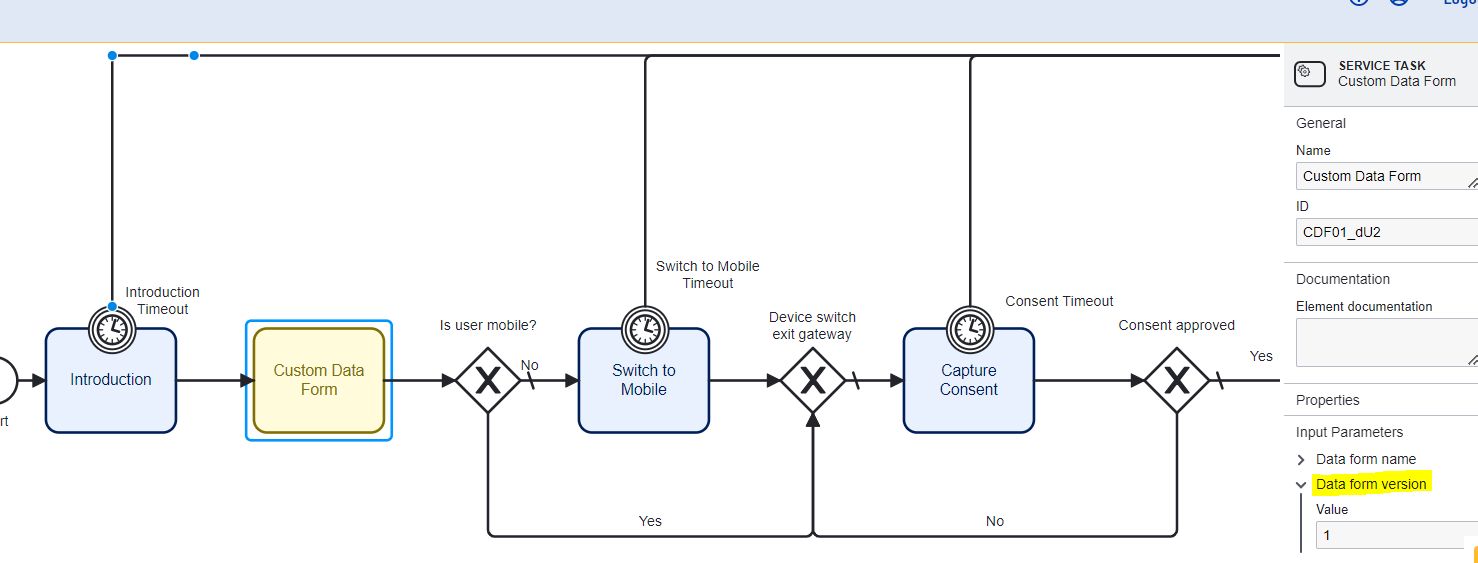
When including a Custom Form as part of a Process Definition, the 'Data from version' input parameter will determine which Custom Form Data version is used.
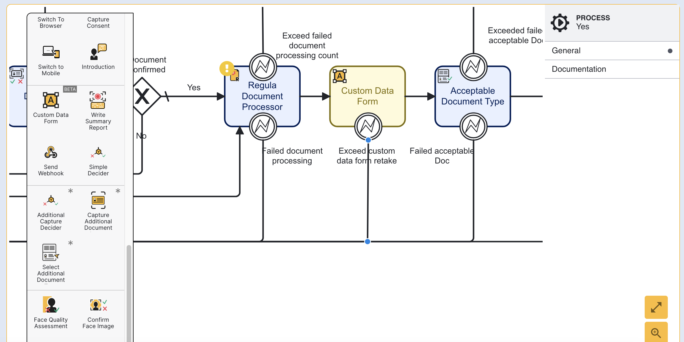
Adding Custom Form to Process Definition
This section will describe the steps required to add a Custom Form to a Process Definition. For more information on Process Definitions, see the Process Definition Guide.
First, navigate to the Process Definitions page found in the left-side navigation menu.
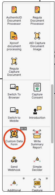
This will open the Process Definitions page. A Custom Form can be added to an existing or newly created Process Definition. In this example, a new Process Definition will be created. From the Process Editor, the Custom Data Form action can be used to add a new Custom Form to the flow.
In the example below, the form will be placed before the Introduction action in the flow. Now a new step in the verification process is added.
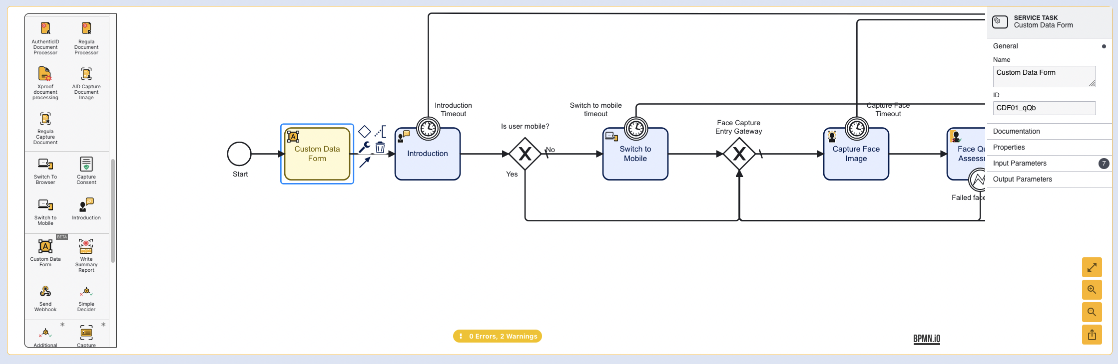
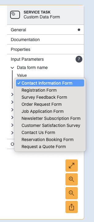
The specific form to display can be defined by expanding the Input Parameters field found in the right-most context menu when the Custom Data Form action is selected. First, click the Custom Data Form action so that it is highlighted blue. Then, expand the Input Parameters field
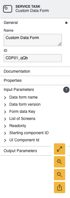
The form can be selected by expanding the 'Data form name' option. This option will provide a list of all forms created in TrustX. Select the form that will be added to the flow using the drop-down list.
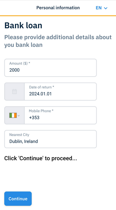
Once all configurations are completed, click the Save & Deploy button to confirm the settings. Now the form can be tested by generating a token for the Process Definition. The below example demonstrates the Custom Form created in the Create Custom Form section above.
Configuration Options
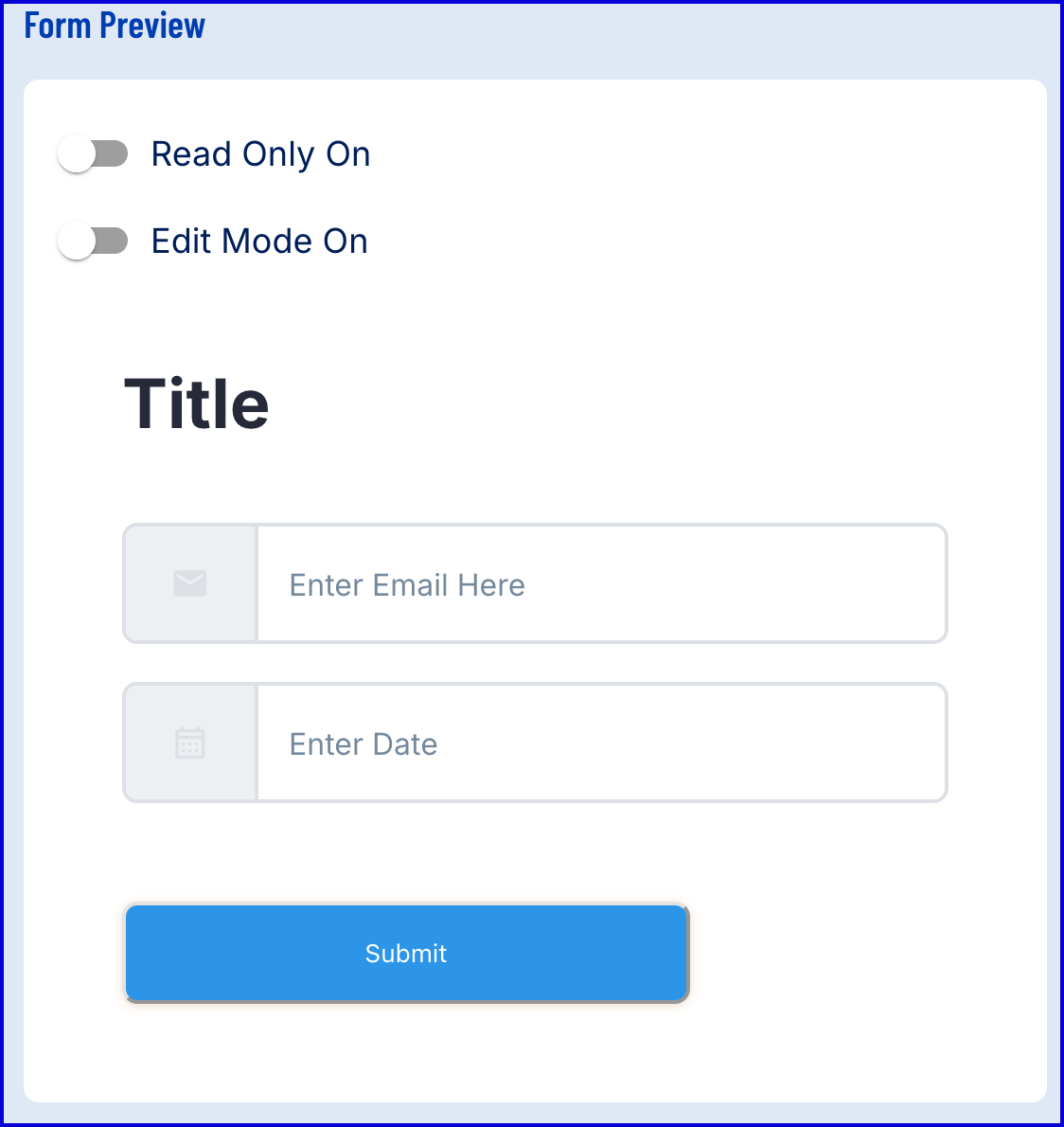
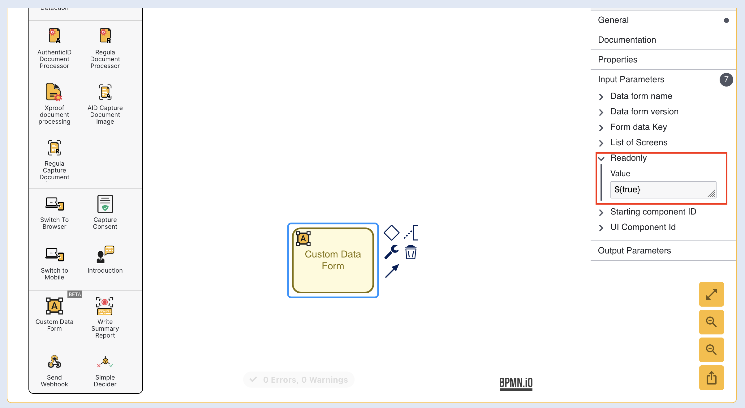
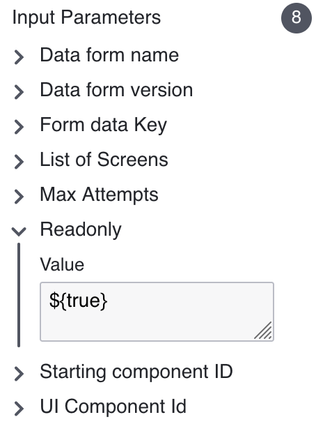
ReadOnly
Custom Data Forms can be configured as readonly information pages using the readonly input parameter. This parameter is found by selecting the Custom Data Form activity and finding the parameter within the right-most contextual menu. By default, this parameter is set to false for new activities. Set this property to true to set readonly as the available option where no inputs will be accepted by the end user.
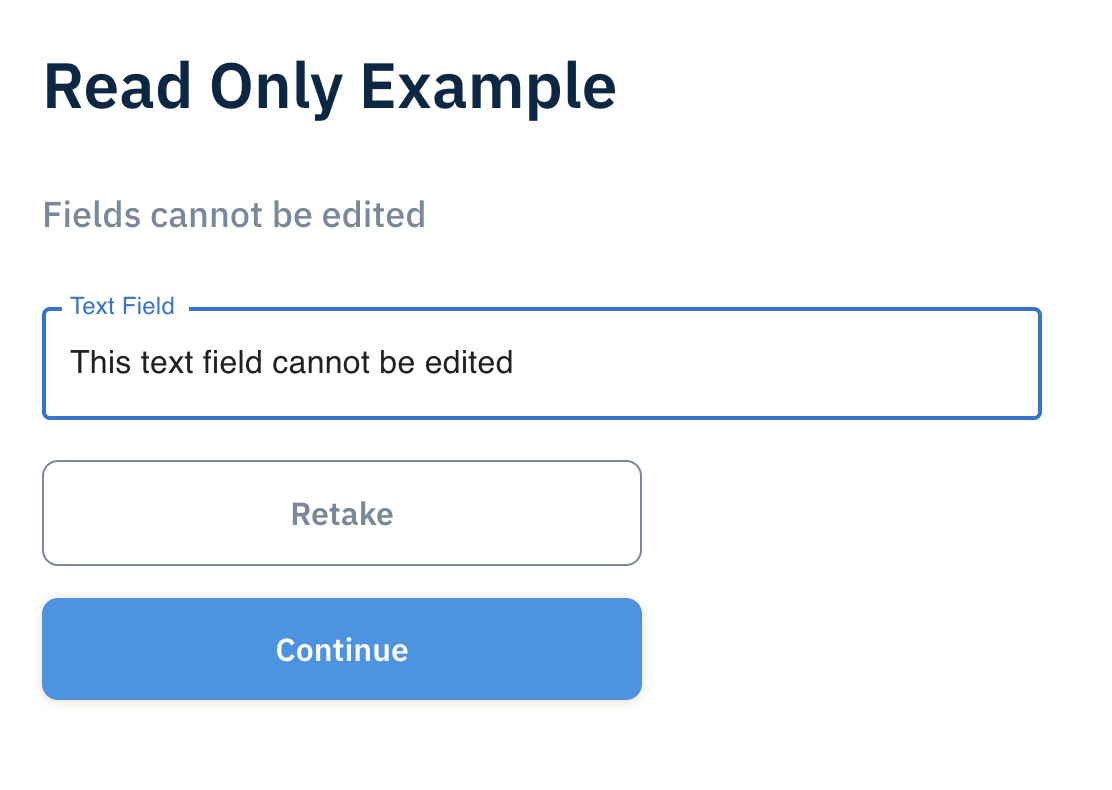
In the example above, the text field presented on the Custom Form page is not editable by the end user.
ReadOnly Per Field
Individual fields of a form can be configured to 'readOnly' when defining the JSON in the Custom Form editor. This method allows for complete control over form fields and allows certain fields to be 'readOnly' while others remain editable to the end user.
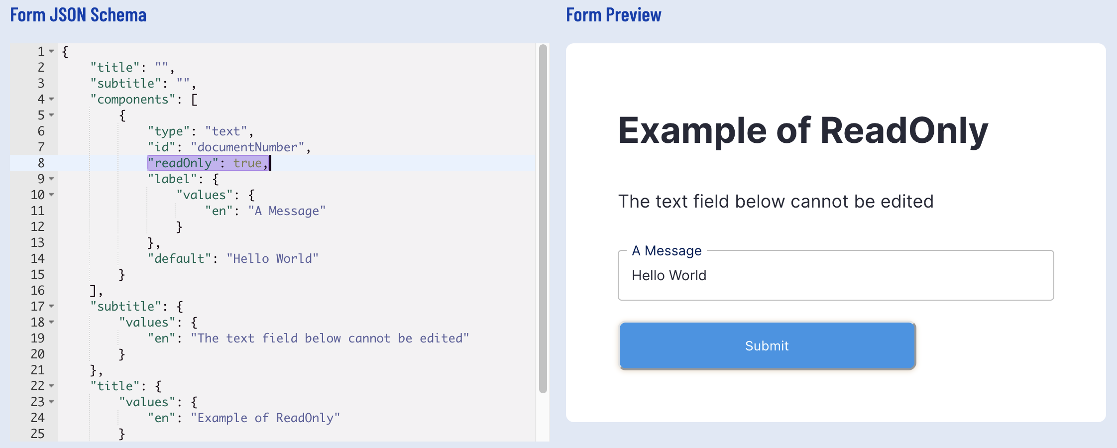
In the above example, the "readOnly": true parameter is used to set the text field component to readOnly.
Multiple Custom Data Forms
When using multiple Custom Data Form activities in a single Process Definition, the Form data key input parameter is used to identify each of the form activities.
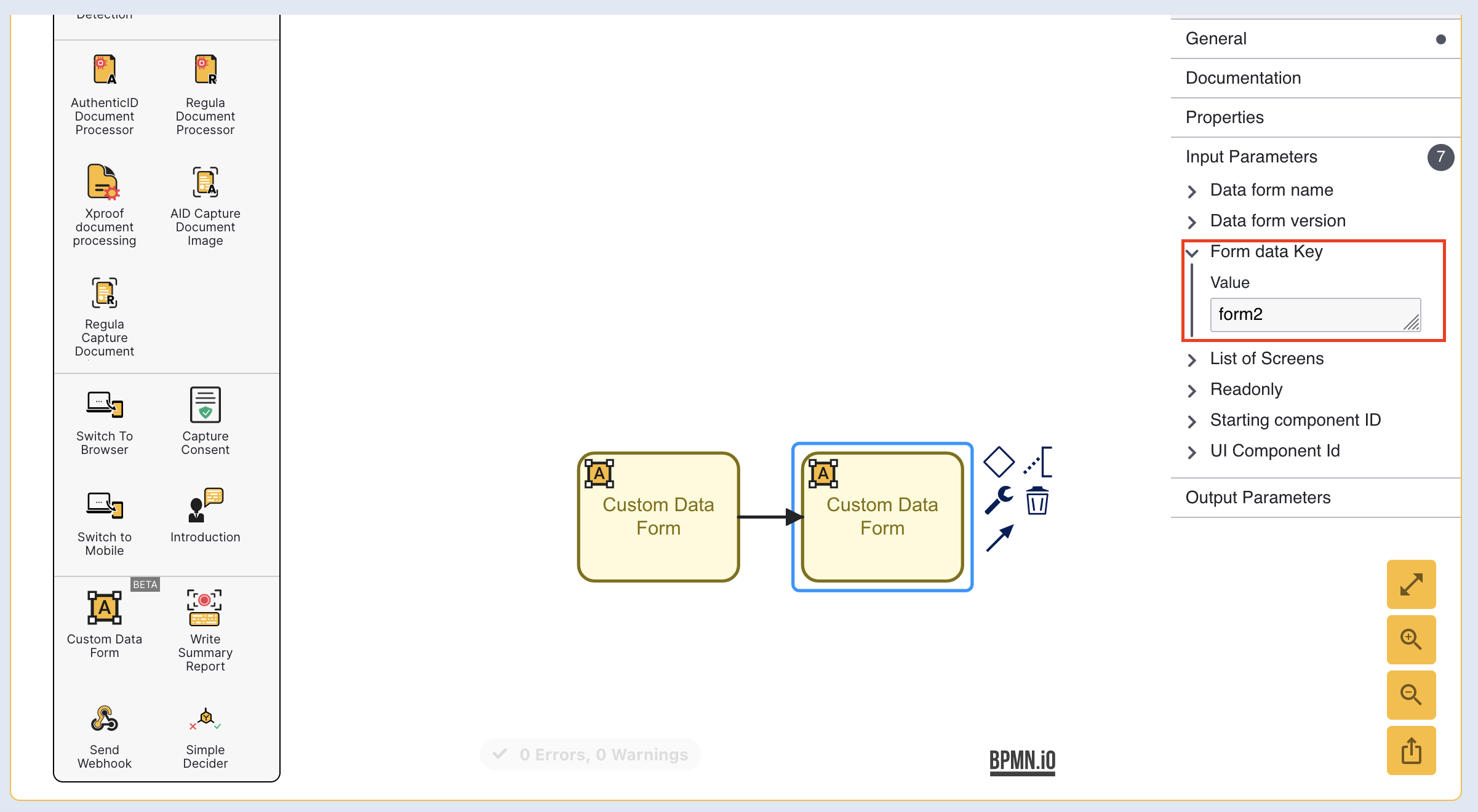
In the example above, the first Custom Data Form activity has a form data key of 'form1' while the highlighted form has a form data key value of 'form2'. This ensures that both forms can be uniquely identified from one another when data is retrieved during the ID&V flow.
Access Custom Form Data
Custom Form Data is accessible to activities, cloud functions, and webhooks through process variables. Data is stored as a key-value pair where the key is represented by the form data key and the value will be the id of the form field that will be accessed.
For example:
${_customFormData["formKey"]["currentCapture"]["customDataFormDataMap"]["formField"]}
Where formKey represents the form key and formField is the field that will be accessed.
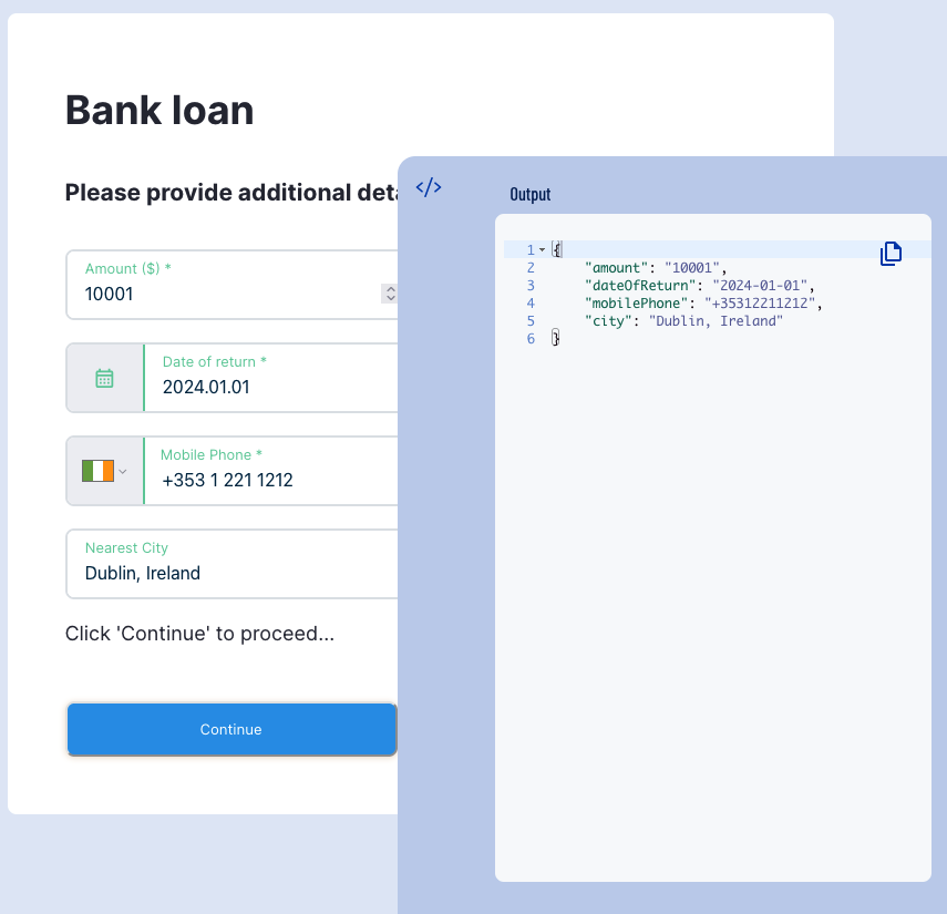
In the example below, we have a Custom Form with a form data key of 'form1'.
To access the 'amount' value from a cloud function, we must use the component id 'amount'.
In this example, the data captured in the 'amount' field of the form will be stored in the formResponse variable.
Link OCR Data to Custom Data Form
Data retrieved from OCR process can be linked to Custom Data Forms to pre-populate fields during the ID&V process. This can be achieved by using the fields returned as part of a Document Check:
Issuing State Code
Document number
Date Of Expiry
Date of Issue
etc...
Configuring the Form
When configuring the form, it is recommended to use readOnly fields to ensure that OCR data inserted into the form is not modified by the end user during the ID&V process. This can be accomplished by making the individual component 'readOnly' or setting the whole form to 'readonly' in the Process Designer.
The example below demonstrates a form text field component and populates it with the extracted Document Number and the date field with the Document Date of Expiry.
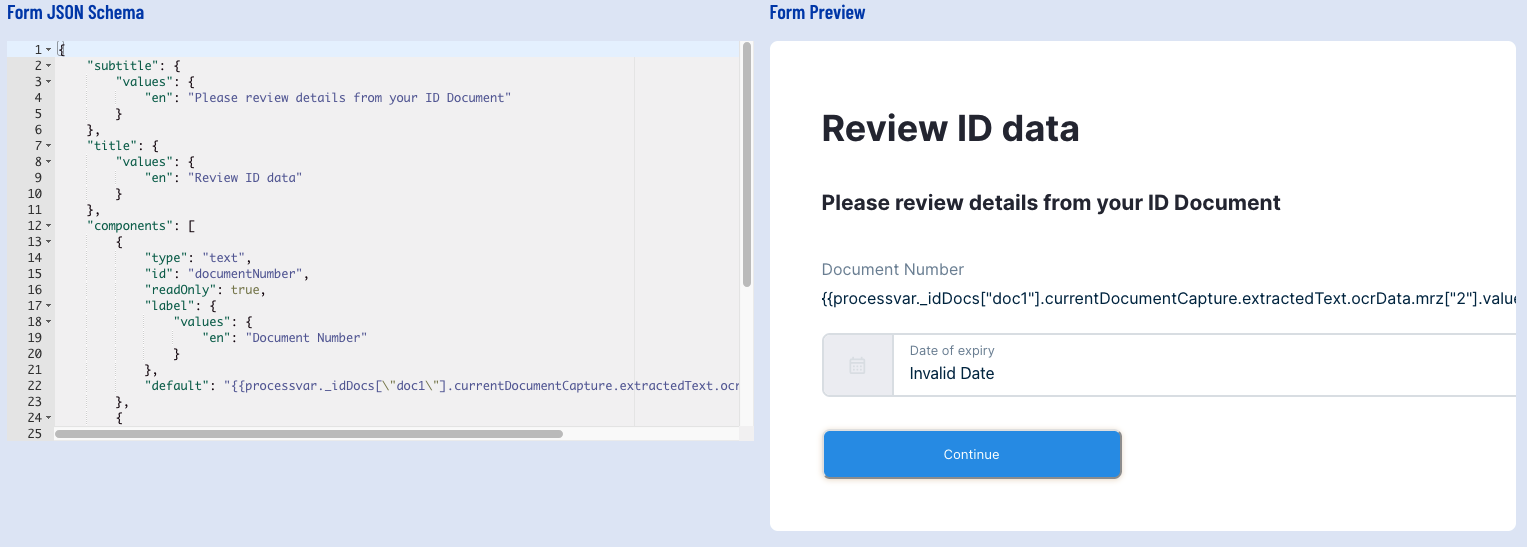
In the above example, the "default" value is assigned to the Document Number retrieved from the OCR data:
(Where idDocs[\"doc1\"] refers to the Document Capture Key and mrz[\"2\"] refers to the Document Number.)
Similarly, the date field labeled "Date of expiry" default value is pre-populated with the document's Date of Expiry.
(Where idDocs[\"doc1\"] refers to the Document Capture Key and mrz[\"3\"] refers to the Date of Expiry.)
Data extracted from the mrz , barcode , and visualZone can be used to achieve this result by following the same format demonstrated above.
For example:
Configuring the Process Definition
It is important that the Custom Data Form activity appears after the Document Processing activity within the Process Designer.
For example:
It is recommended to ensure that the appropriate fields are either marked as 'readOnly' or the form itself is set to 'readOnly' to ensure that the pre-populated "default" values are not overridden by the end-user.
The end result will display a form where extracted OCR data is used to populate fields that are presented to the end-user.
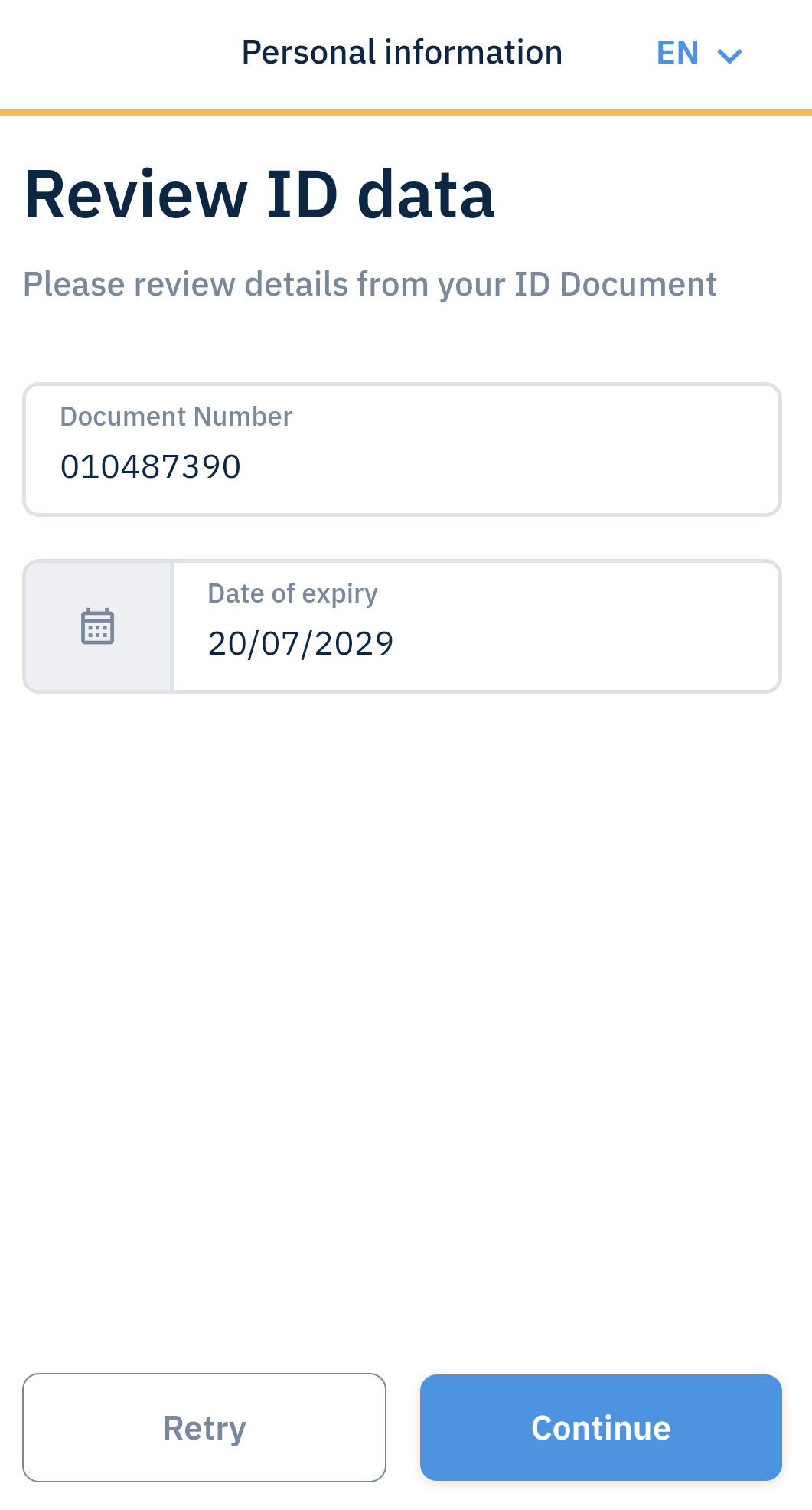
In the above example, a form is shown in mobile browser where the Document Number and Date of Expiry fields are populated with OCR Data.
Note: Variable Substitution Notation
This section applies to TrustX v1.0.16.4
When performing variable substitution within a Custom Form, the notation will determine what data type a value is evaluated as. This is important when the "required" field of an input type is configured to 'true' and will ensure that the data provided is validated as the correct data type.
The example below demonstrates a Custom Form with a text input field. The default value of this input field is based on the output retrieved from a Cloud Function. It is expressed as a JsonPath and will return the data as an array.
Validation for the default value of this text field will not work as anticipated as $..["\cloudFunctions\"].myFunction.metaData.ruleResults.foo will return the the data from the Cloud Function as an array instead of a string. This is because the .. notation is a deep scan operator and will return data as an array.
To return data from a Cloud Function as a string, see the example below:
In this example, the data retrieved from the Cloud Function will be returned as a string instead of an array. This will ensure that validation from the Custom Form will executed as expected.