Themes allow users to update the look-and-feel of the ID&V flow to display a personalized TrustX application to the end customer. This guide will describes how to create a Theme from the Backoffice application and assign the theme to a Process Definition.
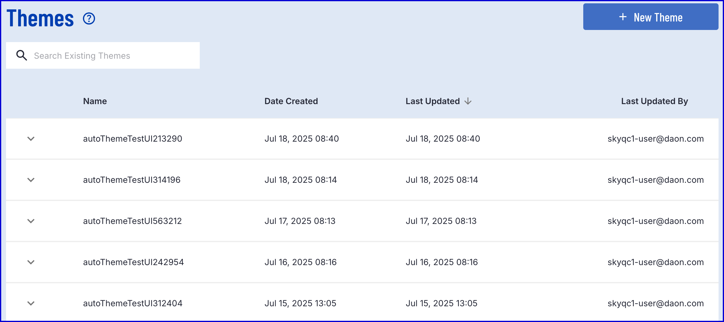
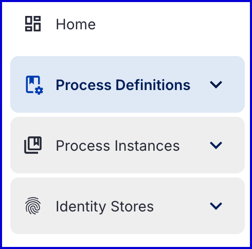
Themes can be created by navigating to the Themes tab found on the left-side navigation bar in the Backoffice application.
The landing page provides an overview of all themes created in the system where the user can search by theme and filter the results table.
Create a Theme
To create a new theme, click the orange 'New Theme' button found on the top-right of the landing page screen.

This will open the New Theme creation page where the colors and assets of the TrustX application can be managed.
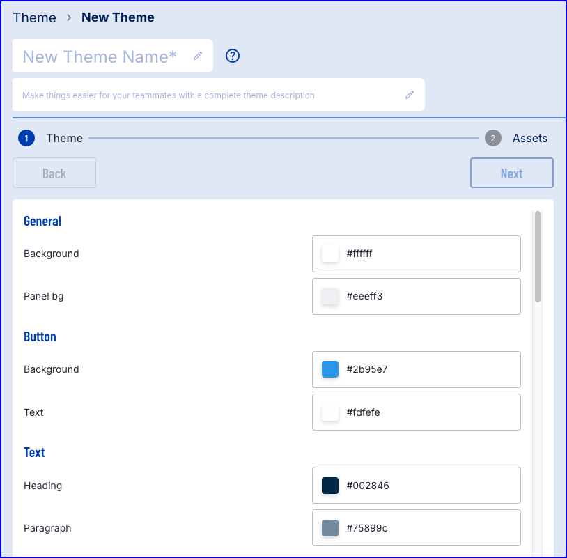
Custom Colors
The first page of the theme creation process allows the user to set the colors that will be displayed on various page elements. A preview is available and can be changed by using the 'Page' drop-down menu. Each element is defined accordingly:
General - Is the overarching theme.
Buttons - Reflect the buttons that appear.
Text - The text on the page.
Input - Will affect elements such as the search boxes where an end-user can enter values.
Country Selection - Enables users to configure the color scheme for the country selection screen.
Document Selection - Enables users to configure the color scheme for the document selection screen.
Document Capture - Enables users to configure the color scheme for the document capture screen.
Face Capture - Enables users to configure the color scheme for the face capture screen.
Header - Sets the color scheme for pager headers.
Stepper - Sets the color scheme of the left-side list of steps that appears when completing the process via desktop.
Progress Bar - Represents the color of the progress bar.
Other - Sets the color of the icons that appear on the intro screen and preview borders.
Custom Settings
This page also allows users to set 'Custom settings'.
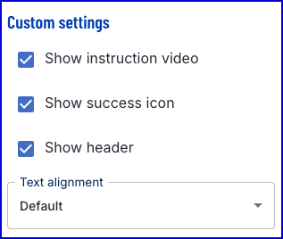
These settings are described as follows:
Show instruction video - Determines whether to show the instructional video that appears at the beginning of the Face and document capture steps.
Show success icon - Determines whether to show the green tick success icon that appears on the Face and Document Preview pages and 'Thank You' page.
Show header - Determines whether to show the page header in the TrustWeb application.
Text alignment - Two options are available that determine the alignment of text elements on the screen. The default value is 'Default' and aligns text according to the chosen language. The second option is 'Central' , indicating center-alignment.
Preview and Export
Using the 'Page' drop-down allows users to select a preview page to view changes that have been made.
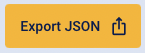
It is also possible to export the color scheme to a JSON file by clicking the 'JSON Export' button. This will include all page elements and their corresponding color represented as a HEX color code.
Once the color scheme has been decided, click the 'Next' button to navigate to the 'Upload Assets' page.
Uploading Assets
Users can upload their logo, icons, and fonts to display on the TrustX application. The Upload Assets page allows users to upload or drag the logo to assign this asset. The following file types are supported: png, jpg, jpeg, webp, gif.
File types up to 5MB are supported.
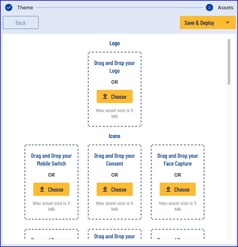
Each asset can be uploaded individually, including icons for each instruction in the ID&V process. Each element can be described as follows:
Icons
Logo - The main logo that will be displayed at the top of the app page.
Mobile Switch Icon - The icon that will appear on the 'Switch to your phone' step.
Consent Icon - The icon that will appear on the 'Consent' step.
Face Capture Icon - The icon that will appear on the 'Selfie' step.
Document Capture Icon - The icon that will appear on the document capture screen.
Additional Documents Icon - The icon that will appear on the additional document capture screen.
Custom Form Icon - The icon that will appear on the custom form screen.
Fonts
Regular Font - The font style used for general text that is displayed to the end user.
Medium Font - The font style used for medium font such as sub-titles.
Semi Bold Font - The font style used for bold font such as headings.
Media
Themes enable users to upload custom images that will appear on the various capture instructions screens. Supported file types include: .jpg, .png, .jpeg, .svg, .gif, .mp4, and .webm. All files have a maximum size of 5MB.
Document Capture Instructions Front - Sets the image that will appear on the front document capture instructions screen.
Document Capture Instructions Back - Sets the image that will appear on the back document capture instructions screen.
Document Video Capture Front - Sets the animation that will appear on the front document video capture instructions screen.
Document Video Capture Back - Sets the animation that will appear on the back document video capture instructions screen.
Face Capture Instructions - Sets the image that will appear on the face capture instructions screen screen.
Manual Capture Instructions Front - Sets the image that will appear on the front manual capture instructions screen.
Manual Capture Instructions Back - Sets the image that will appear on the back manual capture instructions screen.
Switch To Mobile Waiting - Configure the image that appears on the desktop application while the end-user is directed to complete the flow on mobile.
Processing Screen Image Front - Sets the image that will appear during the front facing processing capture screen.
Processing Screen Image Back - Sets the image that will appear during the back facing processing capture screen.
Error
The image that appears on the error screen can be updated to a custom image. Supported file types include: .jpg, .png, .jpeg, .svg, .gif, .mp4, and .webm. All files have a maximum size of 5MB.
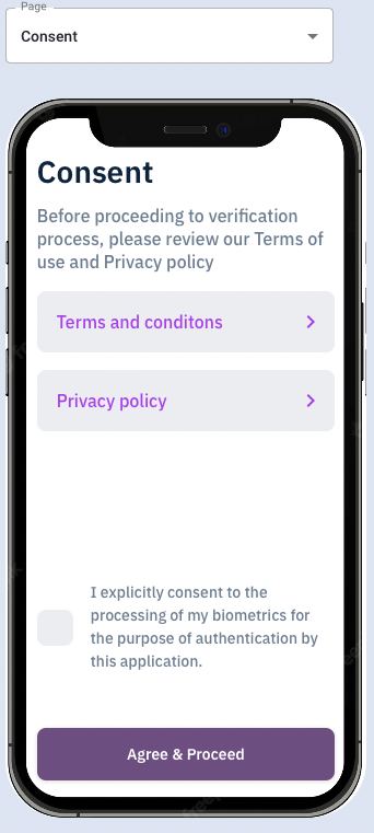
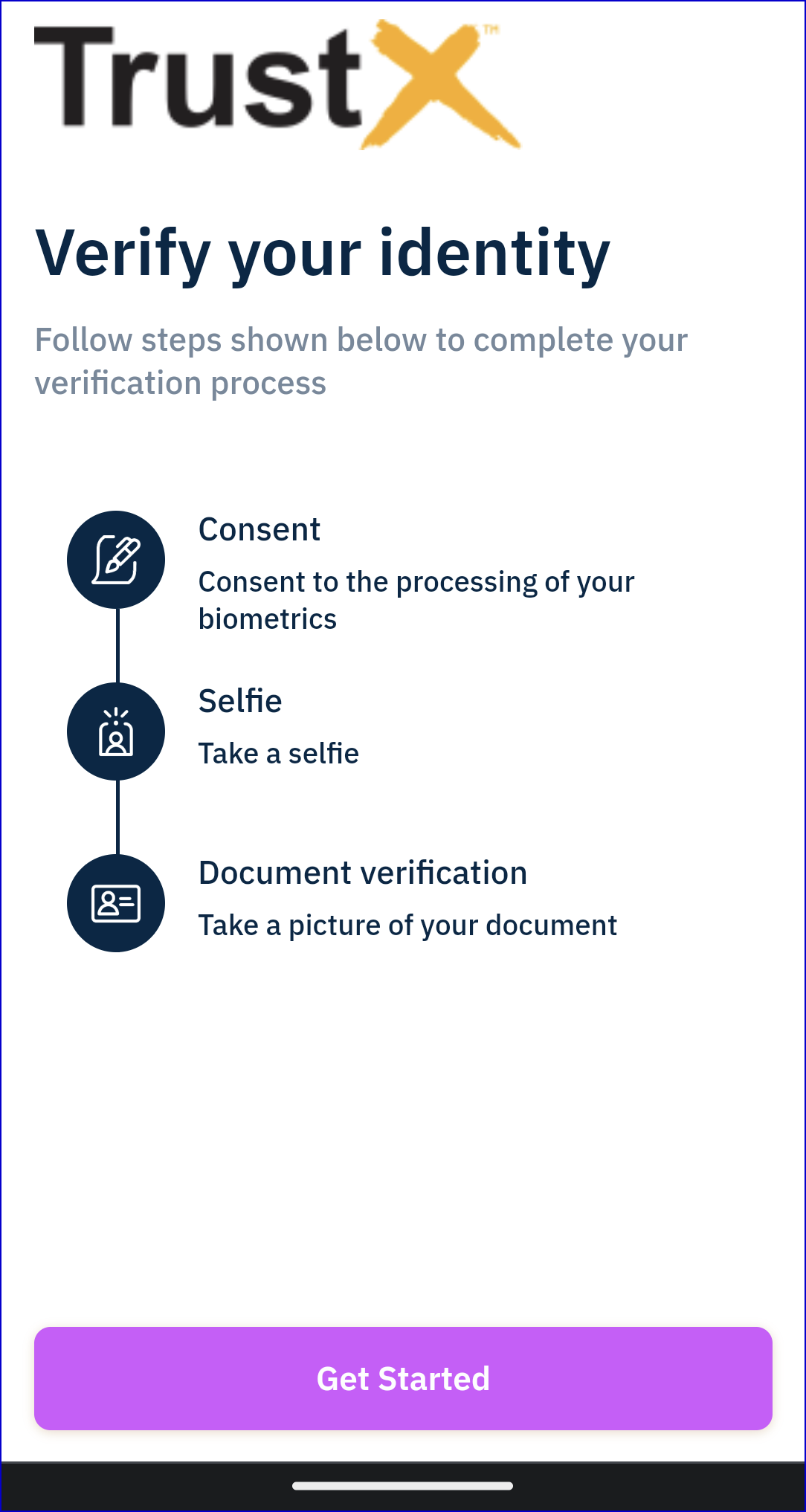
Sample
Below is an example of the Consent activity displayed with a logo configured as part of the theme:
Assign a Theme to a Process
A theme can be assigned to a Process Definition from the Process Definition or per Process Definition token.
Assigning via Process Definition
A 'theme' drop-down box is available that allows users to select from existing Themes to apply to the Process Definition. Once a Theme is selected, the 'version' drop-down box becomes available to choose which version of the selected theme will be implemented.
Navigate to the Process Definition page found in the left-side navigation bar of the Backoffice application.
Under the new or edited Process Definiton, find the 'Theme and Version' dropdown fields where details about the theme can be defined.
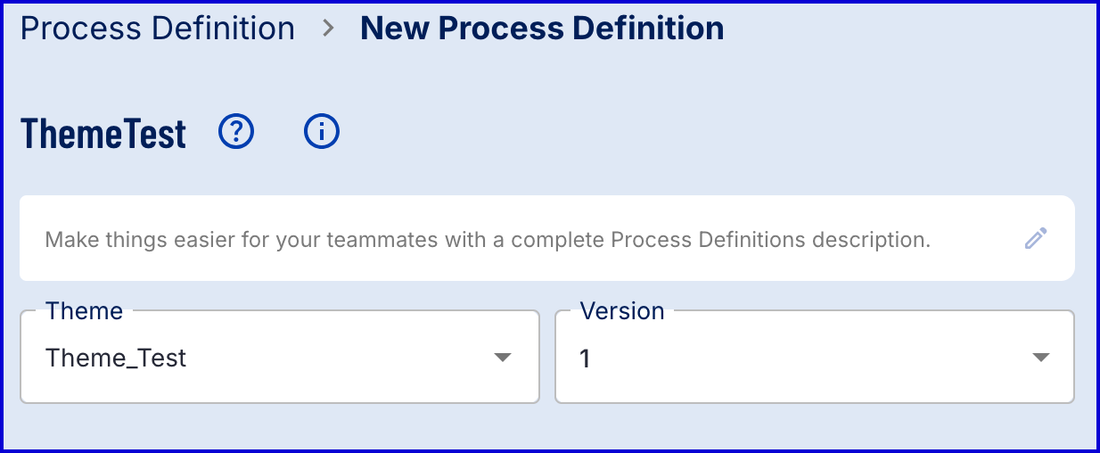
Once the theme is selected and all other configurations are made, click the 'Save' button to complete the creation process.
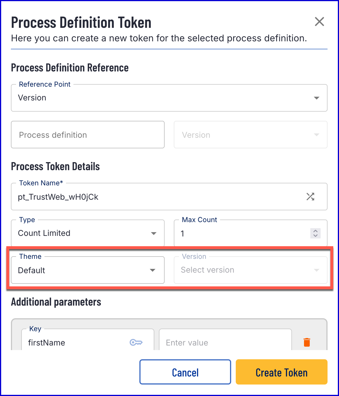
Assigning via Process Token
A theme can be assigned to an individual Process Token upon creation of the token. This method can be useful for assigning different themes per Process Instance instead of one theme that serves all Process Instances.
To assign a theme upon creation of a Process Token, follow the steps outlined below.
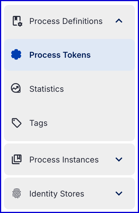
Navigate to the Process Definition > Process Tokens page found in the left side navigation bar in the Backoffice application.
On the Process Tokens overview page, click the 'New Process Token' button. A popup modal will appear where details about the Process Token can be defined.
The theme can be defined under the 'Theme' and 'Version' dropdown fields.
Pass Theme as Process Token Parameter
In some cases, it may be preferred to pass information about the theme into the token URL. This can be useful in situations where the theming of the loading spinner should be presented before the Trust Web application has loaded.
To pass the theme as a parameter via the Backoffice, follow the steps below.
Follow the steps outlined in the Assigning via Process Token above by creating a Process Token and assigning the theme using the dropdown fields available.
Once all details of the token are defined, click the 'Create Token' button to generate a QR code and URL.
When the token is generated, a 'Theme Parameter' checkbox will appear. Toggle the checkbox to enable this functionality. Notice that the URL and QR code will change.
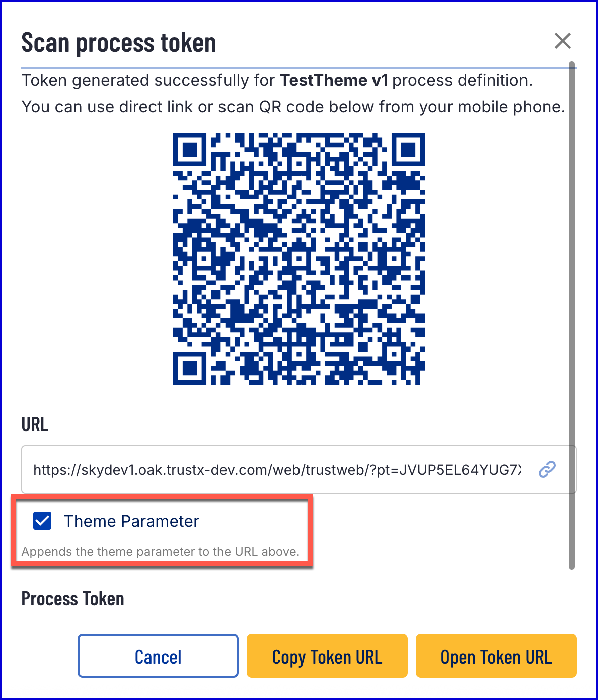
The Process Instance may take longer to load when this functionality is enabled.
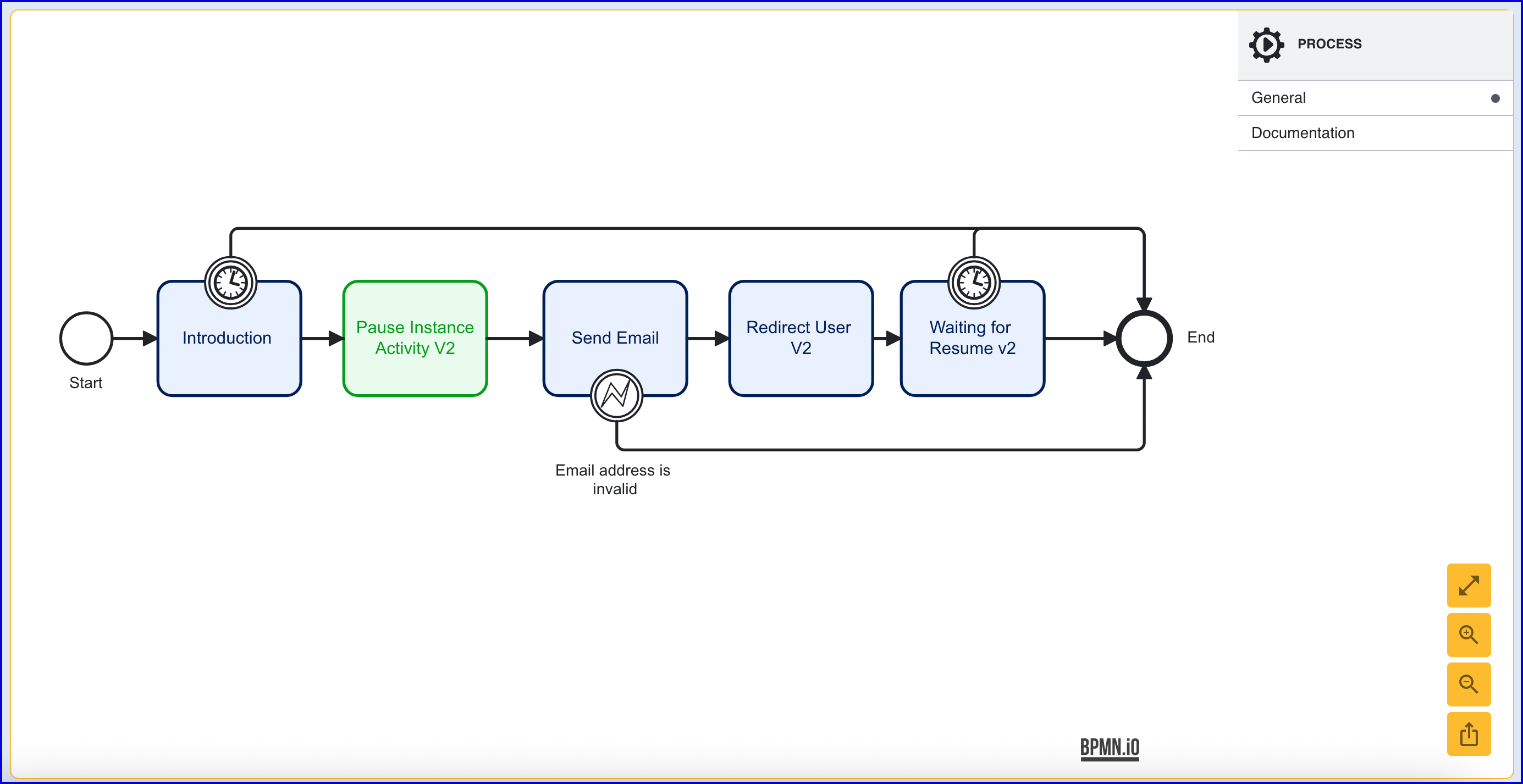
A Process Definition that uses the 'Pause Instance Activity' must used the latest 'Pause Instance Activity V2' or above to ensure that the theme is loaded once the Process Instance is resumed.
For example, the flow below pauses the Process Instance before sending an email and resuming the process afterwards.