TrustX. Make your ID&V process a competitive advantage.
TrustX provides safe, frictionless cross-channel authentication and regulatory-compliant identity proofing and verification at scale. The solution offers an environment where all the necessary capabilities can be developed and deployed with speed and seamlessly integrate within our customer's existing systems.
TrustX instantly verifies and authenticates identity documents with its own proprietary and patented technologies, with flexible no-code workflows, thanks to an orchestration-led approach. This enables easy-to-build verification and authentication journeys.
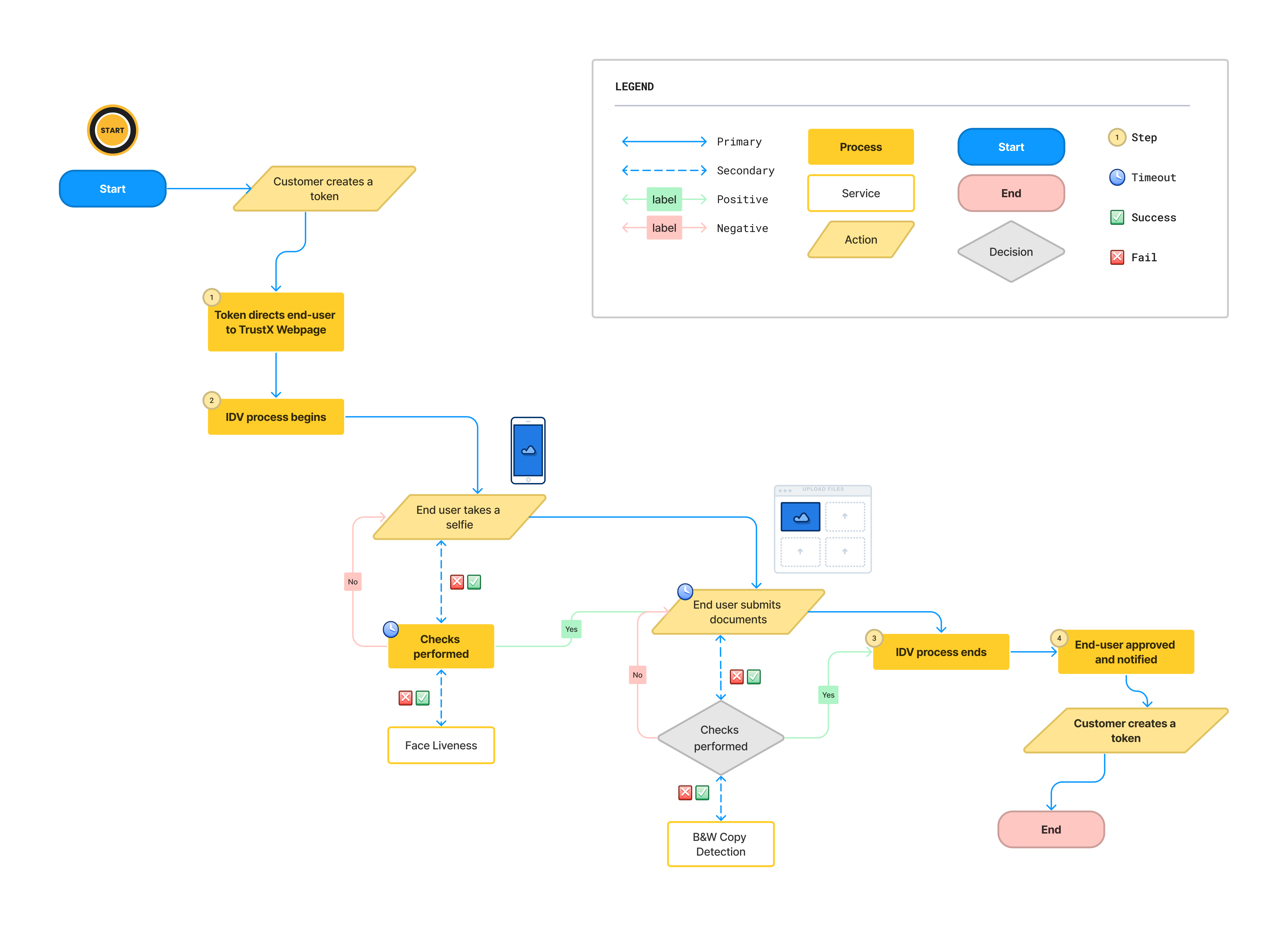
Flow Diagram
Below is a diagram that demonstrates the typical Identity Verification flow of TrustX from the starting node to the end where the end user is fully verified.
Features
Document Verification
Feature Name | Description |
|---|---|
Screen Replay Image Detection | Determines whether the image is being displayed on a computer monitor or mobile device. |
Black & White Copy Detection | Verifies that a document is not a black & white color copy. |
Photocopy Detection | This service checks whether the document is real or a photocopy. |
Color Copy Detection | Verifies that a document is not a color copy. |
Document to face match | Matches the portrait face image from a document against the users face image. |
Photo Substitution | Checks whether the face image belongs to the document or whether it has been replaced or altered. |
Text Substitution | Text Substitution Detection performs a check against a captured document image to determine whether any text on the document has been altered, substituted or obscured from the original document. |
ID Substrate Detection | Determines if the image conforms to the document class lithography manufacturing process (laser engraving and perforation, security threads, etc.) |
PDF417 Barcode Integrity Checker | This service checks if the data extracted from a barcode is formatted correctly based on the exact document class taxonomy and sequence, and determines if the PII matches the OCR data on the front-side of the document. |
PDF417 Barcode Lithography Detection | Checks if the document barcode conforms to the exact document printing class. |
PDF417 Barcode Spectrum Analysis | Examines whether the barcode area and coordinates conform to the closet ink spectrum (metallic, pearlescent, iridescent, metalized DOVID, transparent DOVID, etc.) across its known and measured color spectrum coordinates. |
Driver's Licence Number Validation | Determines if the license numbers conforms to the known RMV number generator algorithm using PII (surname, DOB, sex, region, checksum). |
Landscape Capture Mode | The ability to use the camera in Landscape mode to capture documents. |
Point of capture quality feedback | The ability to give an end user feedback of the quality of the image once the picture is taken. |
Face Verification
Feature Name | Description |
|---|---|
Face Passive Liveness | This feature ensures that a face image is genuine and not a recording taken from a desktop monitor or mobile device. |
Face Quality | Check that the captured face image meets a desired quality standard. |
Document to Face Match | Matches the portrait face image from a document against the users face image. |
Orchestration Layer
Feature Name | Description |
|---|---|
Process Designer | The Process Designer uses a Business Process Model and Notation Diagram (BPMN Diagram) where you can change the Identity Verification flow, and define key elements such as thresholds and algorithms. |
Process Definition | Provides the capability to use the modeling tool to create a new process definition, or edit an existing one. |
Process Instances | Overview of all existing processes at a macro level, with the ability to view the detail of a single process at a micro level (one end-user). |